It was an exciting time. I decided to take my side hustle and turn it into my main hustle. I had years of experience under my belt, healthy relationships with several clients across different industries, and big aspirations for my new business. I was all set for the big time, right? Well, not quite. One of the first steps in getting the business up and running was building a great business website. And as a webmaster who has done this many times before, I knew the importance of having an engaging website that helps clients find what they’re seeking.
Armed with that understanding, I took a step back and asked myself what I needed to make this successful. There were already all these grand ideas in my head for what it should include, how it should look, and how to design the customer journey. I knew that wasn’t enough and that I needed to take a more organized approach if I was to do this right. So, I put together a plan for developing my new business website and then began to execute.
Here are the steps I took to make it happen. I’ll try to keep this pretty high-level without going into all the nitty-gritty technical details.
This post contains affiliate links. I may earn a small commission from purchases made through these links.

1) Identify goals
The very first thing I did was identify the goals that the website needed to accomplish. As a new web design business, I knew I needed to establish some credibility. While my clients, close friends, and family knew what I did (to a certain extent), how would I build trust with the people just learning about me?
Additionally, I needed to define the specific services that I would be able to provide. Coming from a marketing background, I had a pretty expansive skillset (if I do say so myself) but I didn’t want to provide too many services and “muddy the waters”, if you will. I really needed to zero in on what I wanted to do (and not do) to provide clarity to website visitors. Also, I wanted to start small before scaling up. So, it was important to frame that section of the site.
Working with clients in the past, I also often heard complaints about other web designers. Often, they would work with designers that were difficult to reach or too busy to talk to them. Of course, this left to dissatisfaction with clients and many times they ended up leaving. So, it was important that I made it really easy to reach me through the website.
2) Get domain and hosting
Once I had some of the primary challenges and goals captured, I knew I needed to get my domain and hosting set up. Now, there’s a lot that can be said about what companies to work with for each. I’ve been with many companies over the years myself. So, I asked myself what my business would need, especially in the beginning stages. How much traffic am I expecting? How important is customer service? Do I have access to a hosting control panel?
After some consideration, I decided to use NameCheap for my domain and switched to SiteGround for my hosting. So far my experience with each has been very positive (and this is coming from someone that’s used many companies).


3) Look for inspiration
After that part was locked up, I started looking for inspiration. I visited other websites, both in my industry and in other industries, to get ideas for how the site should look. I also considered unique functionalities that would be useful to add. I looked at different interfaces and made notes of what worked, what didn’t work, and what I liked overall.
What would make sense for my website? What would help users when they visited? Is there anything I’ve done before that could be applied here? I considered these things and many more before designing anything.
via GIPHY4) Choose platform and template
With some solidified ideas in my head now, I was ready to choose a platform and template for my business website. I already knew beforehand that I’d be using WordPress for the website build. I’ve built several other sites with WordPress, and I enjoy the flexibility and support that I get from the site. Additionally, did you know that over 40% of all websites on the web are built with WordPress now? With that in mind, I knew that there was a large community of developers and designers that could provide support and collaboration too.
Afterwards, I chose a light template within WordPress where I could customize it how I wanted – I chose the WordPress 2020 theme.

5) Site map
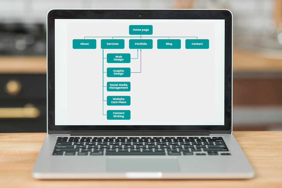
This was a pretty easy step. Because the website was not going to be that big, the site map came together quickly. I created a list of pages that the website would contain, and where they would be in the overall navigation. The plan was always to keep it simple.
6) Wireframes
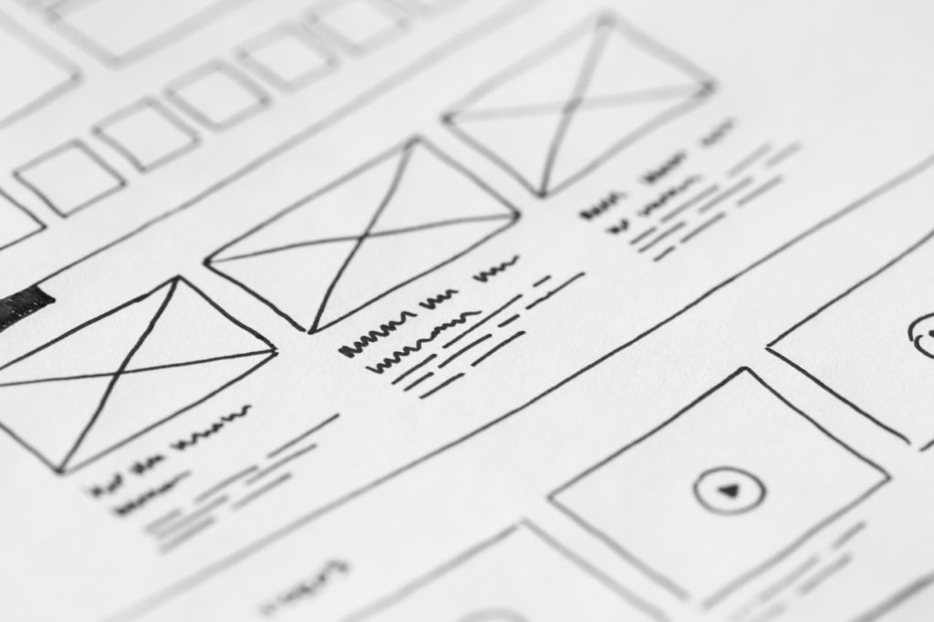
I was finally ready to get the thoughts in my head onto something tangible. I began to draw my website on paper (yes, paper) to lay out how the site should look. While there are other ways of doing this (ie through software), I’ve found the analog approach works well for me. I used to design site maps through Photoshop, but I found that it was sometimes time-consuming to transfer design elements into CSS and HTML. The paper format works well for me.
7) Begin design
Ok, now the fun part! Once I had a lot of the pre-work completed, I dove into WordPress and began designing the site. I already had a wireframe so I was able to create the sections fairly fast. I also had put together branding guidelines, so I was able to apply those as well. I did wrestle with certain decisions (for example, pictures to use), so that took me some time. There was also some new functionality I wanted to implement (for example, the phone number on the front page that changes its display for mobile), so I also spent time learning and experimenting too.
Of course, another part that took time was writing all the copy. There were many pages to create content for, and I wanted to make sure everything was explained well. So, in addition to some of the visual elements, I also spent much of my time writing.
via GIPHY8) Optimize and review
After many revisions, and through gathering feedback, I felt comfortable with how the website looked and functioned. At this point (and especially after such a long road), temptation was creeping in to launch the website. But I knew there was still a few more things to do before we reached that point.
I needed to optimize the site now so it performed well. The first thing I did was look at the photos on the site and make sure they were compressed and sized down. Large photos can slow down your site, so it’s important that they’re the right size. I also converted the icons throughout the site to an SVG file format, which 1) increased quality and 2) decreased file size. And lastly, I installed a plugin for caching to help with performance.
via GIPHY9) Publish my business site
Ok, the big day was here. After creating a plan for the website, designing and building it, and refining things to get it just right, we were ready to launch! I shared the website across my social media platforms, and directly with close friends and clients as well. It was an exhilarating, kind-of-nerve-wrecking, rewarding feeling. Perhaps it was because I had planned this site for years in my head? Or maybe it’s because I knew how much work was put into it.
via GIPHY10) Continue to tweak and adjust
Once the website was live, I knew it was important to continue making modifications where necessary. Whereas some people may think the work is done once it’s live, that’s not entirely true (actually it’s not true at all). A website needs TLC so it continues to perform well, while also addressing the needs of your audience.
After the website was launched, I received even more feedback from people about what they thought. From what they liked to what they didn’t understand, it was all valuable information. Based on some of those helpful comments I received, I went back in and continued to tweak things. I didn’t take all the advice – you have to be your own filter and apply the changes that make sense to you and your audience.
Another thing I did was look at my Google Analytics after the first month to see how the website was performing. Where were people spending the most time? How long were they staying on the site? At what place did they decide to leave? Those insights were helpful as it allowed me to continue making smart adjustments.
And there you have it. After many, many steps, these were the actions I took to design my business website. If there’s one takeaway from this, it’s the importance of planning. If you notice, I didn’t start designing until way later in step 7. By developing a plan, you have a strong foundation upon which to build your website.

